Project: “Dot”
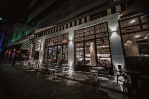
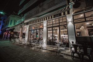
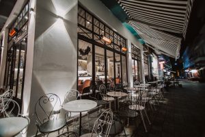
This coffee place was already existed. The new owner wanted me to refresh it and to make it look like we created it from scratch. That was really difficult, but challenging at the same time. I started from the exterior with black and white stripes awning, because I wanted to give tension and movement to the outside space. At the same time, all the industrial look of storefront’s metals was painted black and I chose white walls for the contrast and for the building to pop out.
In order to combine the look, the outside furniture is black and white metal with marble table tops, French table base look and French “heart curve” chairs.
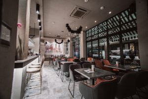
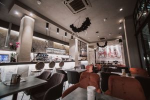
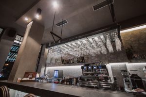
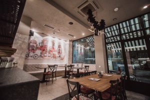
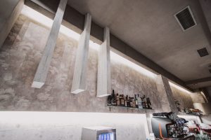
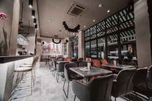
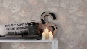
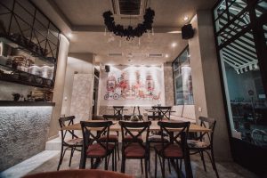
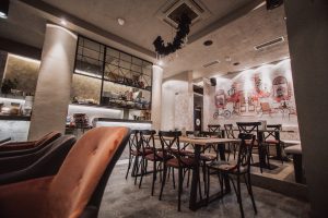
For the interior, the colors I chose were salmon, grey and white and the materials were: Montpellier’s floral vinyl wallpaper, floral granite tile for the bar’s face, an old wooden metal community table, asymmetric floor and a French painted mural at the back.
Interior – Exterior Designer
Stavros Solakakis

